Miles Dash Camera
Miles Cam is a dash cam startup focused on helping parents and new drivers build trust behind the wheel. While many competitors position themselves around surveillance, accidents, and worst-case scenarios, Miles Cam sought to create a more approachable experience centered on transparency, protection, and peace of mind.
Tree Ring Studio was tasked with developing a comprehensive brand identity system that would resonate with parents of teen drivers while remaining modern and appealing to a younger audience. The project included brand strategy, logo development, typography selection, color palette creation, and the design of a flexible visual system that could extend across digital platforms, marketing materials, and future product applications.
The resulting identity balances confidence and warmth, creating a brand that feels dependable without being intimidating. Inspired by classic American road trips and the freedom that comes with driving, the system helps position MilesCam as a trusted companion for families navigating the journey of a new driver.
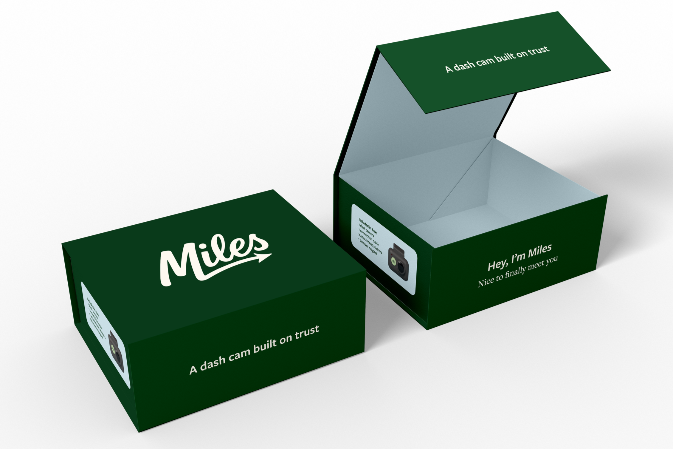
A dash camera built on trust
Industry
Client
Miles Cam
Consumer Technology / Automotive
Brand Strategy, Visual Identity, Logo Design, & Brand Guidelines
Year
2025
Services
1
"Freedom when you're driving. Protection when you're not."
Brand Essence
2
Audience
Parents of teen drivers.
3
Positioning
Trust, transparency, and peace of mind.
Logo Development

The Miles Cam logo was designed to reflect the brand's balance of freedom and protection. Drawing inspiration from classic automotive branding, the wordmark feels confident and dependable while remaining approachable, humanistic, and easy to recognize.
The logo evolved into a clean, versatile mark that can scale across digital platforms, marketing materials, and future product applications. Its simplicity allows the brand to feel established and trustworthy without relying on the overly technical visual cues commonly found within the dash cam industry.
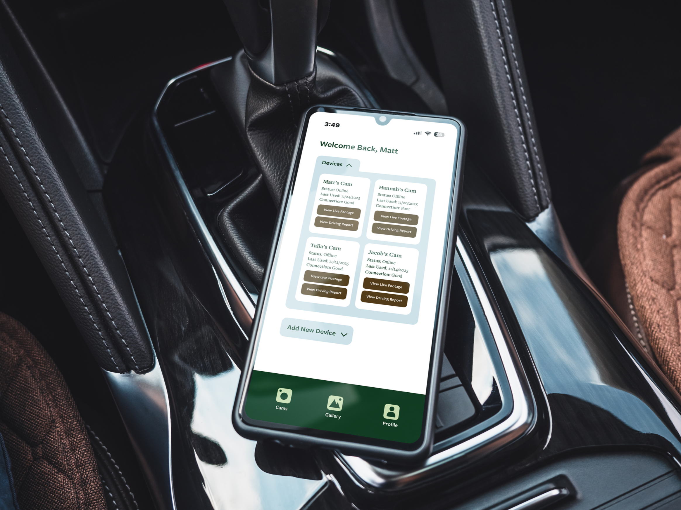
Visual Identity System
Miles Cam's visual identity was built to communicate trust, transparency, and peace of mind. Inspired by the open road and classic automotive heritage, the system balances warmth and reliability with a modern, approachable feel.
A palette of earth tones and muted blues reinforces a sense of stability and confidence, while the typography pairing combines clarity with character. Together, these elements create a flexible visual language capable of supporting everything from digital experiences and marketing materials to future product and packaging applications.
Color Palette
Inspired by road trips, natural landscapes, and the trustworthiness of established automotive brands.
Trail Green
Horizon Blue
Canyon Brown
Signal Green
Dusk Blue
Typography
Freight Sans and Freight Text were selected for their versatility and timeless character. The pairing balances modern clarity with a sense of familiarity, helping Miles Cam feel approachable, trustworthy, and built to last. Used together, they create a cohesive typographic system that supports both digital and print communications.

Primary Typeface
Headlines, navigation, marketing materials
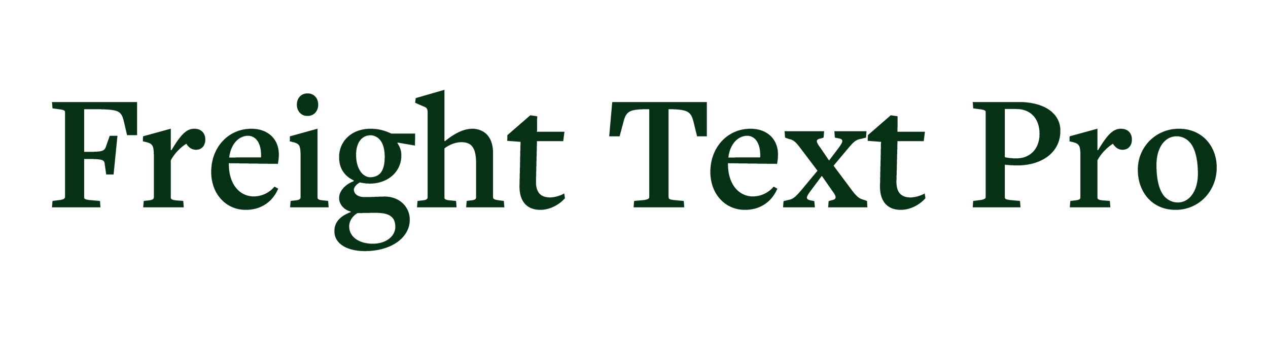
Secondary Typeface
Body copy, supporting content, longer-form communications
Brand Applications